"Fully Fledged"
This project represents the most effort I've ever put
into a digital graphic. In fact, since I was never really an art
major, it's the most effort I've put into any project. Unfortunately,
it's also the biggest disappointment. Nothing like hopelessly jaded
critics and teachers to bring one's already minute ego down to an appropriate
size. My thanks to you all for making me feel like a tiny, tiny man.
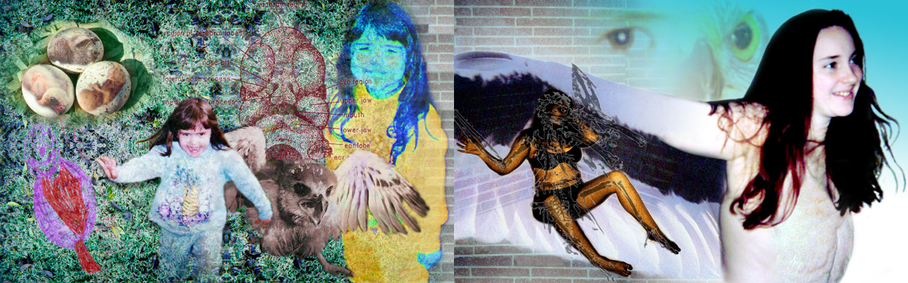
Enough already. The media (originally):
Photoshop 5.0, Macintosh scanner, Power Mac computers, printed out on two
uncoated 11 X 17" sheets (1" margin all around) plus two 8.5 X 11" transparent
sheets. What can be seen above is the two 10 X 16" graphics side-by-side,
with a representation of the transparencies as semi-opaque. Imagine
the sheets on the left sides of the two posters. The birds and fetus
on the eggs, child drawing, and fossil outline were printed exclusively
on the transparencies. It's easier to look at than explain.
An HP DeskJet handled all the dirty work, except for the fossil, which
was printed with an Apple LaserWriter.
The grass, bricks, 5 year old girl, background eyeball,
and older girl were from photos taken by me, except the eye, which was
taken by her mom. The kiddie drawing was courtesy of the same girl,
scanned directly. The hawk eyeball, infant letter-winged kite, letter-winged
kite wings (on older girl), hatchlings, and chest feathers all came from
a book on hawks from the library. The fossil was from a black and
white book on hawks. The human fetus, and diagram of the human fetus'
head came from a book about (drum roll please...) fetuses.
What I learned from all this (would have if I'd
taken a single art class in high school):
-
Keep all aspects of the project in context. The jogging suit on the
little girl is too cheezy, I might have gotten away with blanking out the
design and maybe changing the color.
-
Know thy media. The transparencies were stuck-on with the plastic
covers of nine-volt batteries. Really unprofessional. I should
have used something else as a spacer, but nothing came to mind at the time.
-
The art-looking-at public of the world doesn't give half a crap about who
your family and friends are, or how cool they look in photos. De-personalize
EVERYTHING, as much as possible. Getting your models to avoid eye-contact
with the camera is useful in this case.
-
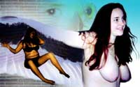
Tits+face=porn. Vagina+face=porn. Really huge tits, face or
no face, can still be porn. There's not much getting around this,
especially if you're not an established artist. If you've got street
cred, you can apparently pee on as many crucifixes as you like, but if
you're an ad major...DON'T TRY IT! Do I sound bitter?
-
If your teacher hints at something (repetition of elements, patterning,
different color schemes, deconstruction of dominent elements...), even
slightly, it means they expect you to use it in the next assignment.
In other words, use it, or accept a C- for your originality.
-
Your fellow students may be your bosom buddies in the classroom, but if
the teacher says that your final project is absolute crap, you'd sooner
see them coming to the support of Hitler Satan Hussein Jr. Not that
any kind words from them would have any affect on your grade, either.
-
I don't really pee on crucifixes, it was just an example.
Regardless of my own gripes about the image, I hope you, the webgoer, enjoyed
it before I said anything. Special thanks go to my cousin Tori and
my friend Jennifer, who helped me an awful lot with the project by being
part of it. For a glimpse at the original (porny) version of page
2, here it is: